
Optical illusion every designer should know
If you’ve ever worked on creating a logo, you’ve probably had to test it on both a white and a dark background. This is good practice because it’s important for the logo to look consistent in different variations.
Most people think that all you need to do is change the color. But it’s not that simple. Something strange happens: in white screen, the logo looks “thicker.”
Look at the example above. The outline of the symbol in the white logo looks thicker. This is especially noticeable when comparing the two lines that form the shape of the leaf in the center. In both cases, the thickness of the outline is the same.
Changing the color has led to the same logo looking like it has gained a bit of weight! Strange, isn’t it? This illusion is called the Irradiation Illusion.
Irradiation illusion
The term “irradiation illusion” was coined by the German scientist Hermann von Helmholtz in the 1860s to describe a visual perception in which a bright area appears larger than a similar dark one. Galileo had already noticed this effect, referring to it in his observations of the sizes of planets that he observed through a telescope at different times of the day.
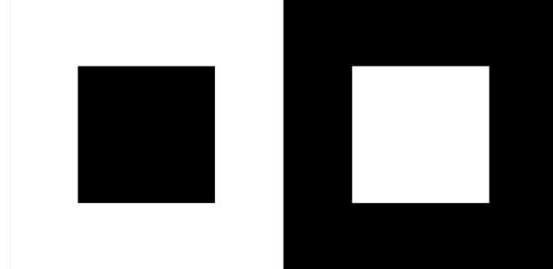
Classic example of the irradiation illusion
In the example above, you can see that the inner white square on the background of a larger black square looks larger compared to a similar black square on the background of a larger white square. But why does this happen?
Scientific Explanation:
After conducting a series of studies, scientists have arrived at a preliminary conclusion: the sizes of the squares captured by the retina are the same; therefore, the perceived difference in size occurs at the level of the primary visual cortex (note: the area of the brain responsible for the initial processing of visual information).
Dr. Jose-Manuel Alonso, a neuroscientist from the College of Optometry at the State University of New York, recently conducted a more thorough investigation and delved deeper into this phenomenon.
The visual system has two primary channels: neurons sensitive to light, called “ON” neurons, and neurons sensitive to dark objects, called “OFF” neurons. Both types of neurons were recorded in the study.
Scientists found that “OFF” neurons predictably and linearly respond to dark figures on a light background: the greater the contrast between the dark and light objects, the more active they become. However, “ON” neurons disproportionately reacted to light figures on a dark background: at the same level of contrast, their response was much stronger.
Grant Oushen, an independent research specialist, provides an excellent explanation for what can cause such a reaction.
It is well known that light has a physical impact or conveys energy that affects our retina and sensorily stimulates it to facilitate vision. It is also a fact that white color reflects (or re-emits) more light energy (or photons, to be precise) than black color; therefore, a small white square emits a higher level of energy than a small black square.
The squares are identical in size but re-emit photons of different densities. The small white square has a higher photon density (generated by a higher intensity of light force); thus, it can activate a larger area in the primary visual cortex. The more light energy an object reflects, the larger it is perceived.