Baby Yoda, but make it creepy: You need to see these concept drawings
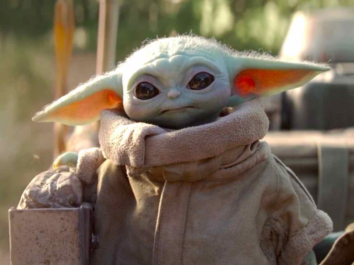
Sending the internet into an absolute frenzy, the debut of the adorable Baby Yoda (officially called “The Child”) in The Mandalorian charmed everyone in an instant. Becoming a worldwide phenomena, Baby Yoda inspired a plethora of memes, merchandise, & buzz for Disney’s hot new Star Wars series.
With those big eyes & ears coupled with an itty-bitty body, this little pumpkin waddled right into our hearts. Extremely force sensitive & amusingly mischievous, Baby Yoda is impossible not to adore – even our stoic mercenary lead falls for the little bundle of joy, becoming a passionate protector.
However much we cherish Baby Yoda now, we may not have felt the same way if some of the original designs were chosen. Early concept art can be wonderful to witness – but Baby Yoda’s early design? Let’s just say – we’re grateful none of them took. Despite how much we wish we never saw them, we just can’t look away. Check out these unsettling early designs of Baby Yoda.
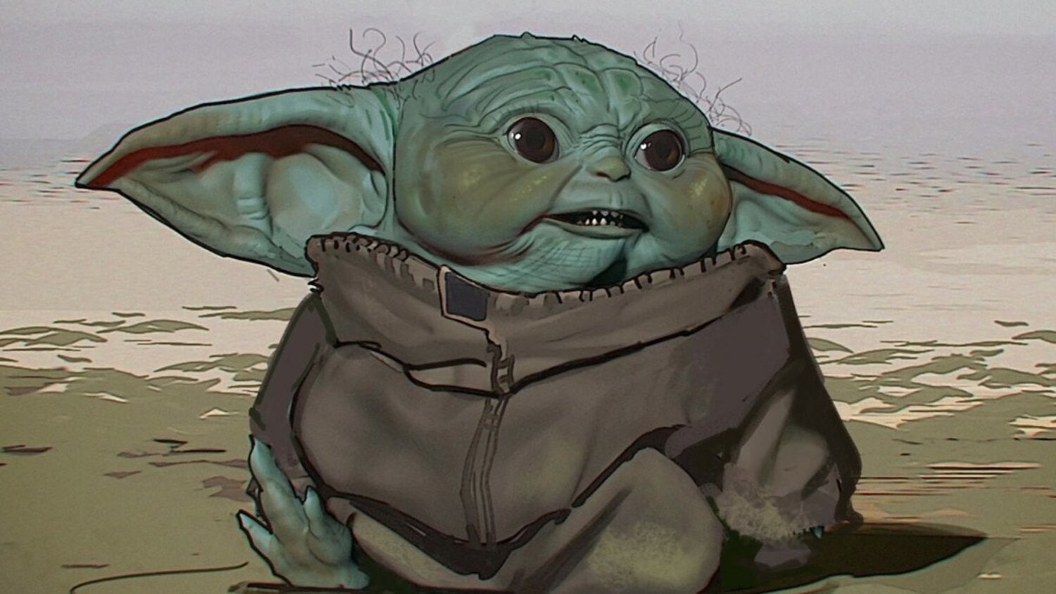
Alarmed & displeased? Yeah, you’re not alone. In this design, Baby Yoda looks more like a goblin than our precious little tot. Baby Yoda may be fifty years old, but does he really have to look it? With those grisly hairs, wrinkles, and sharp teeth, this Baby Yoda’s face would not be plastered all over the internet right now. Look at those giant ears! Could anyone even walk with those massive things on their head?
We understand that deriving a baby model of the iconic Master Yoda isn’t an easy task. Especially considering we know so little about Yoda’s species. There isn’t even a name for the species yet. But even Yoda was cuter than this depiction of The Child. Thank goodness this design wasn’t the winning contender. Otherwise we can’t be sure Mando would be as keen on risking his life for the child.
The Mandalorian showrunner Jon Favreau illuminates a part of the rough creative process when it came to Baby Yoda’s design. He says: “We got lots and lots of drawings. Some of them were too cute, some of them were too ugly, some of them were the wrong proportions.”
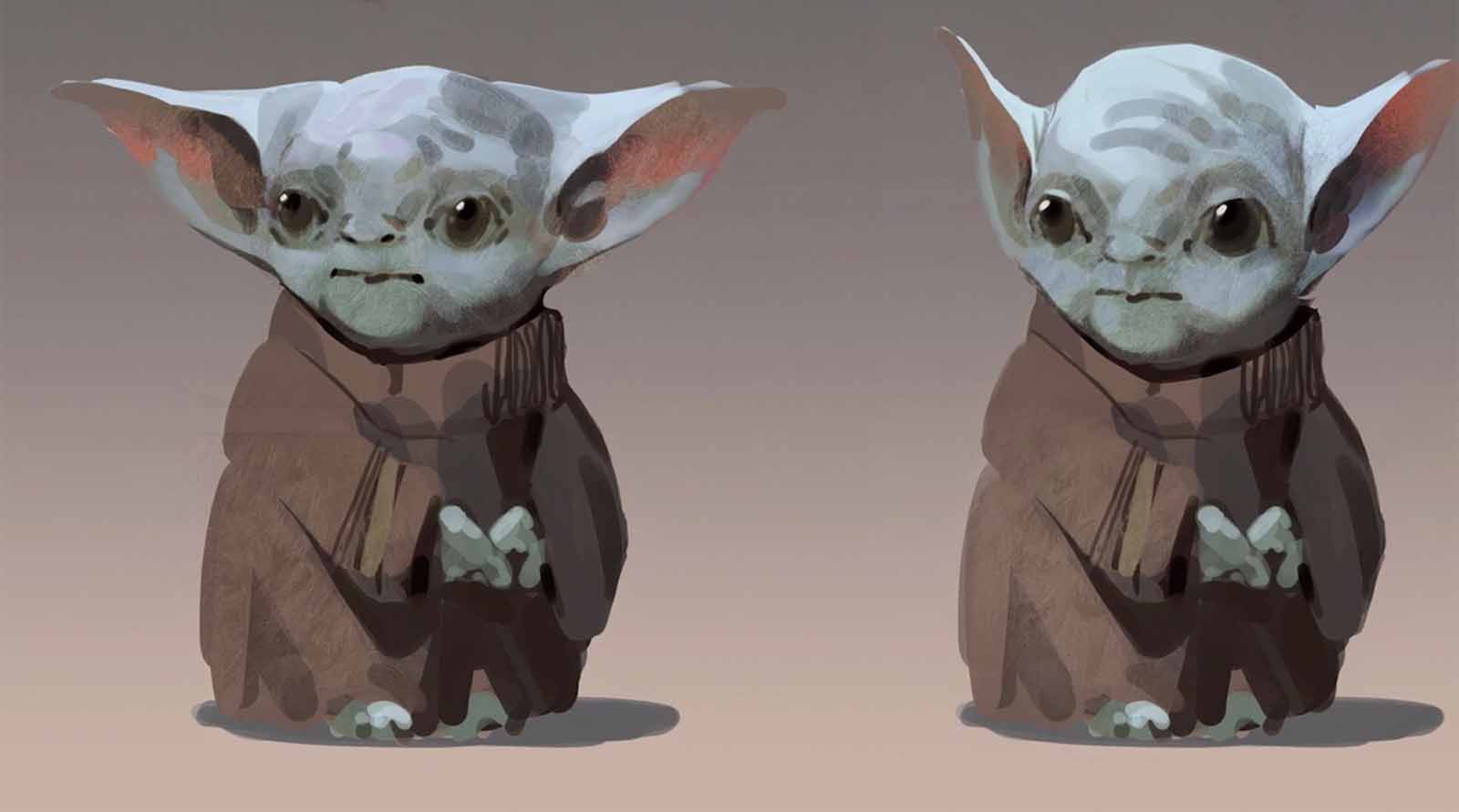
Yes, Jon Favreau – it’s extremely evident that “too ugly” applies here. Thank you for insisting that Baby Yoda needs to be cuter. Thank you. We hope this image doesn’t resurface – it’s hard enough to look at once without our divine image of Baby Yoda being shattered.
Other designs of Baby Yoda emphasize the whole “wrong proportions” aspect. Did these designers forget what Master Yoda actually looks like? How did these designs end up looking so strange?
Remember all those frogs Baby Yoda caught for a snack? Well, I guess the idea here is, you are what you eat? Baby Yoda looks much more like a frog with strange elf ears than a young Master Yoda.

This last one isn’t so bad – but it’s still a bit bizarre. Why is the head shaped that way and why does he have a red Rudolph nose? This version of Baby Yoda hardly looks like an innocent baby – it looks older and more aware. Where is our sleepy & pure Baby Yoda who lights up the screen with every expression?
Yes, Baby Yoda is an alien – who isn’t in the Star Wars universe? But did our favorite character really have to be designed to look so strange & foreign to us in these? At least we can rest easy knowing that they made the right decision in the end. Despite the rocky start, Baby Yoda’s winning design is perfect. We’ll just have to pray we forget about Baby Yoda looking any different. Please let us forget. Please.


