Top 5 Google Sheets Charts for Data Stories
Google Sheets is one of the most popular web-based free charting tools. The tool helps both small and developed businesses find meaning in their data. It helps in data cleaning, gathering and visualization to help stakeholders make impeccable development decisions. The only thing you need in order to access Google Sheets is an email account, and you are good to go.
The tool comes with a wide array of charting options that gives you the freedom you deserve during data visualization. When using Google Sheets, you only need to make a few edits to the final output and have the job done. The charting options provided by Google Sheets make it easier for you to compose your data stories.
However, there are people who haven’t interacted with Google Sheets charts before. This blog post sheds more light on different types of charts on Google Sheets that are vital in your data stories. Read this article for more details!
What are Google Sheets Charts?
Google Sheets is an application that comes with multiple in-built charts that you can use when creating your data stories. The charts are meant to help small and developed businesses visualize their data with a lot of ease. With this tool, you don’t have to pay anything since it offers all its features free of charge.
You can use Google Sheets to bring your data stories to life and achieve your objective in business. However, this can only come true if you have a tight grasp of different charting types provided by the tool. Do you know any type of Google Sheets chart? Read more!
When to Use Google Sheets charts
Google Sheets charts are vital since they help to simplify the complexity of data and make it easier to digest. In addition, the charts make data stories attractive and irresistible and channel them to the right audience. The chart can help you to prove productivity and efficiency within your job environment. If you have the right chart, you can be able to recognize any possible risks, such as a decline in the rate of productivity.
Personalization of Your Business Offers
Currently, selling quality products is not everything you need to fight to achieve. Apart from having quality products, you need to invest in personalization, and products that suit the consumers. With Google Sheets charts, you can analyze the taste of your target audience and serve them with exactly that.
You can use charts to collect data from different attributions and use them to get a picture of your target audience. Once you collect the minds of your customers together by getting feedback in Google Forms, you can easily find the best route to strike and win their trust. Note that this can only be achieved through personalization.
Simplify Data Interpretation
Data interpretation is one of the integral roles of Google Sheets charts. Dealing with complex data sets can be tough, especially if you lack technical skills. If you have the right charting tool, you can visualize large sets of data without struggling and affecting the quality of the output. Also, you will find it easier to consume the critical metrics related to your business.
When you notice any cases of anomalies in your metrics, you can choose to dig down deep and find out more. It will save you time since you won’t spend the whole day working on your data, trying to unmask the message behind the data patterns and trends.
Predict the Behavior Change Among Customers
The current world gives consumers a wide variety of choices. When your business is designed to align with the consumer needs and expectations, you are likely to find yourself in a downward spiral. When customers get exposed to more information, they change their minds and behavior. Every business owner needs to work with this change to avoid making losses.
To detect these changes, you need to have powerful charting options that will evaluate your customer data and uncover insights. This will place you in a better position to detect the new shifts and tastes among your customers. With the changes in mind, you are likely to offer your customers exactly what they want.
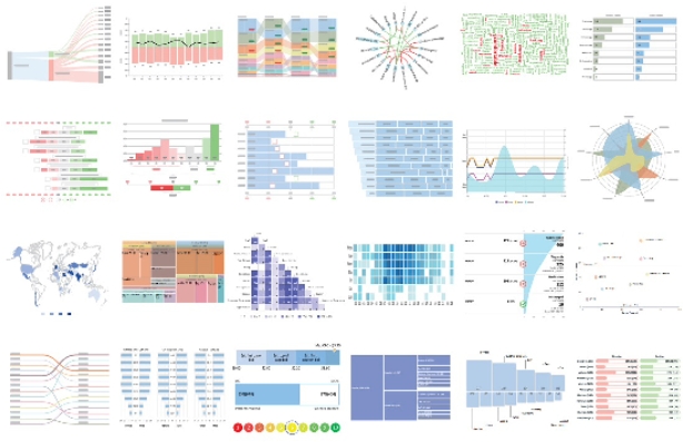
Types of Google Sheets Charts for Data Stories
There are different types of Google Sheets charts on the web that are most suitable for data stories. Below are some of the charts that you need to know how they work and how you can use them for your data stories.
Area Chart
The area chart is a visualization design made of different colors and lines used to showcase trends and patterns in your data. Besides, this charting tool works almost the same as the line graph since they share many similarities. In both designs, all the key data points are connected using lines. What makes the area chart different is that it uses colors.
The area chart is the best data visualization design that works well when displaying key data points, patterns, and trends in your data. If you aim to uncover the patterns and trends in your business data, the area chart is the best tool to use since it has all the features you need to do the work.
Box and Whisker Chart
The box and whisker chart is one of the Google Sheets charts used when dealing with large datasets. Also, it can visualize complex data sets in the form of quartiles and averages. The chart can also help you point out outliers in your data. The box plot is meant to visualize data in the form of segments and outline the key variables in quartiles.
When using this chart, you can draw boxes that connect the first quartile to the third quartile. This is mainly done when representing the average values across all the fundamental data points.
Sunburst Chart
When you look at the sunburst chart keenly, you will realize that it looks similar to a pie chart. However, a sunburst chart has the center of it cut outward to showcase data hierarchy. The chart works best when used to visualize the proportions of different data categories that contribute to making up the whole data.
A sunburst chart is pretty easy to read, just like a pie chart. Regardless of the nature of your target market, readers can easily juggle through the presented data and get the point correctly. In addition, the data values outlined in a sunburst chart can be twisted and make suit your needs.
Sankey Chart
A Sankey diagram is one of the most creative Google Sheets charts. The chart is primarily applicable when you want to gain In-depth insights from your data. A Sankey diagram depicts data in the form of flows, thus giving you different angles of viewing your data. The flows can be used to display energy, time, cost, material and many others. You can use this option when you want to display complex processes in a visual way.
The chart offers supportive data viewing levels that enable users to view specific details. Also, it’s a better choice when identifying dominant contributors in your data.
Grouped Bar Chart
A grouped bar chart is used to visualize categorical data values with the aid of rectangular bars. The chart can also help you when comparing individual data points or aggregate values. Note that an individual bar chart can only compare individual data points. This is contrary to a grouped bar chart where every bar is aligned with another one using contrasting colors to make comparisons.
This Google Sheets chart can also screen your data to identify outliers. Also, it can save you a lot of time since the process takes the shortest time possible.
Conclusion
Google Sheets stands out as one of the free tools that business owners can use to collect, analyze and visualize data. The tool can be easily accessed by anyone with a Gmail account without paying for anything. The tool comes with a sizable number of charting options that you can use to convert your boring data into impeccable visuals.
In addition, you need to be a technical expert in using Google Sheets charts. Every aspect is outlined clearly, and you can use the chart when you want and how you want.